|
|
Post by StortfordSpur on Jan 14, 2007 18:52:35 GMT -1
Coxy used the wrong premiership logo
|
|
|
|
Post by GresleyRam©®™ on Jan 15, 2007 12:36:35 GMT -1
Coxy used the wrong premiership logo That can be changed though - its the basic design we are after, then it can be modified if need be (IE: get shot of Ian Fuckin Moore!!) ;D ;D |
|
|
|
Post by CHOPPER READ on Jan 15, 2007 12:39:54 GMT -1
Where the fuck are my offerings? Thought they were quality i did. Chopper is angry.........
|
|
|
|
Post by Mrs H on Jan 15, 2007 12:45:38 GMT -1
I voted for you Gres because you're bigger than me!  |
|
|
|
Post by GresleyRam©®™ on Jan 15, 2007 12:46:34 GMT -1
I voted for you Gres because you're bigger than me! Thanks Mrs H - i can cross you off my 'DEATH' List then!! ;D ;D |
|
|
|
Post by Mrs H on Jan 15, 2007 12:50:10 GMT -1
I voted for you Gres because you're bigger than me! Thanks Mrs H - i can cross you off my 'DEATH' List then!! ;D ;D Well to be fair Gres you're bigger than everyone.....and I'm glad you don't want me dead. |
|
|
|
Post by jh1980 on Jan 15, 2007 12:56:38 GMT -1
CoxyThis is the one I'm going for, not quite sure where the choice of teams comes from but Cardiff is on there so I'll not complain. It might be an idea to have the crests of all the teams we currently have fans of... which might be a bit excluding but then again there's unlikely to be a membership boom again any time soon is there? Lee Not sure about the Jokerman font mate...otherwise I really like it. Gresprobably my favourite concept here but I don't like the font (Comic Sans?) and the rings of Saturn are too translucent... great idea tho. StortfordSorry mate but no. Really no! LollipopIt's pretty cool Lolly but I'm not sure. Maybe it's the writing... oh and it looks like a hooped shirt, if you get me! Jammy If only the writing was clearer I reckon that'd be ideal as a neutral candidate... but it isn't so... 
|
|
|
|
Post by JJ on Jan 15, 2007 12:57:15 GMT -1
Another vote for Gres as it looks the most professional to me. All really good though
|
|
|
|
Post by spurrsgirl on Jan 15, 2007 13:14:08 GMT -1
After careful consideration, I will go with Lee's suggestion. Its bright and cheerful so there ! ;D
|
|
|
|
Post by Tony Yeboah's Lunchbox on Jan 15, 2007 13:17:57 GMT -1
I've not voted as i didn't think it would be fair but i think Coxy should win. I don't really see a huge issue with the whole representation of fans thing, i can't see many people giving a fuck about what logo's are on the design or not lol. Plus, i think he made his from scratch. Where its predominantly white too, it is fairly neutral and will fit into most backgrounds.
|
|
|
|
Post by GresleyRam©®™ on Jan 15, 2007 13:19:31 GMT -1
i think Coxy tried to represent most of the 'well supported' clubs on here to be honest - he'll walk it!  |
|
|
|
Post by spurrsgirl on Jan 15, 2007 13:22:52 GMT -1
i think Coxy tried to represent most of the 'well supported' clubs on here to be honest - he'll walk it! so long as he changes the Spurs badge to the current one ...... |
|
|
|
Post by HURLOCK on Jan 15, 2007 13:45:25 GMT -1
Where is my entry!
|
|
|
|
Post by HURLOCK on Jan 15, 2007 13:46:14 GMT -1
Coxy gets my vote
|
|
|
|
Post by The Lucky C on Jan 15, 2007 13:57:23 GMT -1
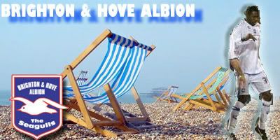
I like Coxy's one, but I'm going to be self-serving and bitter here - where's the brighton badge! I know we have more Brighton fans than Chelsea fans on here...
Ok, I'm just bitter at seeing the Palace badge and not the Brighton one
|
|
|
|
Post by GresleyRam©®™ on Jan 15, 2007 13:59:15 GMT -1
i think Coxy tried to represent most of the 'well supported' clubs on here to be honest - he'll walk it! so long as he changes the Spurs badge to the current one ...... Ha Ha - thats my fault!! ;D ;D He IM'd me on AOL to see if i knew which one was which, so i guessed! ;D ;D |
|
|
|
Post by Imp on Jan 15, 2007 14:00:00 GMT -1
I've voted for Coxy's, I've always thought it was a really great design, but I stand by my original claim that it's not got Lincoln City's logo on it...yes, it matters to me  |
|
|
|
Post by GresleyRam©®™ on Jan 15, 2007 14:02:56 GMT -1
I've voted for Coxy's, I've always thought it was a really great design, but I stand by my original claim that it's not got Lincoln City's logo on it...yes, it matters to me give the guy a break - there's only room for so many!! Maybe he'll swap a few around, but someones gonna be pissed off no matter what cos he cant fit all 92 teams in it! You'll have to ask him very nicely imp - he's up for a bit of bribery!! |
|
|
|
Post by The Lucky C on Jan 15, 2007 14:05:34 GMT -1
I've voted for Coxy's, I've always thought it was a really great design, but I stand by my original claim that it's not got Lincoln City's logo on it...yes, it matters to me give the guy a break - there's only room for so many!! Maybe he'll swap a few around, but someones gonna be pissed off no matter what cos he cant fit all 92 teams in it! You'll have to ask him very nicely imp - he's up for a bit of bribery!! yeah, but put teams on that are supported on here! |
|
|
|
Post by Fizzy Bread on Jan 15, 2007 14:31:49 GMT -1
I've voted for Coxy's, I've always thought it was a really great design, but I stand by my original claim that it's not got Lincoln City's logo on it...yes, it matters to me give the guy a break - there's only room for so many!! Maybe he'll swap a few around, but someones gonna be pissed off no matter what cos he cant fit all 92 teams in it! You'll have to ask him very nicely imp - he's up for a bit of bribery!! We can get rid of the Norwich logo for the Imps! |
|


 Forever without exception. x